Drupal 7 has a plethora of excellent contributed base themes available: Zen, Omega, Gesso, and AdaptiveTheme to name a few. We evaluated a number of them, and all of the themes have their own advantages. We wanted to determine whether we should develop our own base theme or use one of the established contributed ones.
Some of our clients need to have a lot of customizability in the front end for placing content in specific regions in specific site sections under certain circumstances. We decided to utilize the panels module to give the site maintainers as much flexibility as possible.
As a result, we were looking for a base theme that had the following attributes:
- Responsive
- Panels-friendly: the page layout could easily be controlled with panels.
- SASS-friendly: the theme structure was designed to work with SASS instead of static CSS.
- HTML5 based.
- Followed design best practices (e.g. SMACSS)
- Lightweight
A few themes met this criteria, but Aurora was the most lightweight, and it worked with the Singularity grid framework that we already liked. Aurora is designed to be used with panels, so it was ideal for our purposes.
We also developed a custom module that provides plugins for responsive panels layouts and pane styles - both for page layouts and mini panels. While it is possible to place these in a theme instead of a module, having them in a module makes the layouts available to any theme enabled on the site and allows the same module to be reused across multiple sites.


Example panels layouts: conditional sidebars, 2, 3, and 4 columns
Because different clients might want different ratios for content to sidebars, the SASS associated with the responsive layouts is part of the theme layer rather than part of the shared module.
Inspired by other base themes, we developed a base theme on top of Aurora that we could use as a starting point when building a new responsive site for clients. This theme contains the SASS that integrates with our custom library of responsive panels layouts. The exact ratios for columns and gutters can be tweaked on a per-client basis. It integrates well with Panels, Clean Markup, and Blockify. Its organization and naming conventions were influenced by SMACSS and the Gesso theme.
We typically integrate our themes with Font Awesome to provide an extensive library of icons. There are a number of discussions of the pros and cons of using pngs, font icons, and SVG, and arguments can be made in favor of any of these. However, in our case, using font icons with the Font Awesome SASS toolkit allows our clients to easily swap out icons on buttons and in menus without our intervention and without the need to generate new png images. (The Menu Attributes module is very helpful in the case of menus.) These icons also look much crisper on retina displays and can be themed using CSS.
We also define breakpoints in our themes for the Breakpoints and Picture modules. The breakpoints correspond to SASS variables that are then used throughout the theme with the help of the Breakpoint SASS plugin.
One of the challenges we encountered with using SASS at both the base theme level and at the site theme level, especially in multi-site installations, was that we did not want to duplicate the base theme SASS in each site theme. To reduce duplication while maintaining a high amount of flexibility, we create a site-theme partial that defines variables like font, base font size, and breakpoints along with a site-theme partial for color variables. Then we import those two variables partials, base theme partials for items like basic elements and layout, and finally a partial containing custom site-specific styles into our main site theme SASS file.
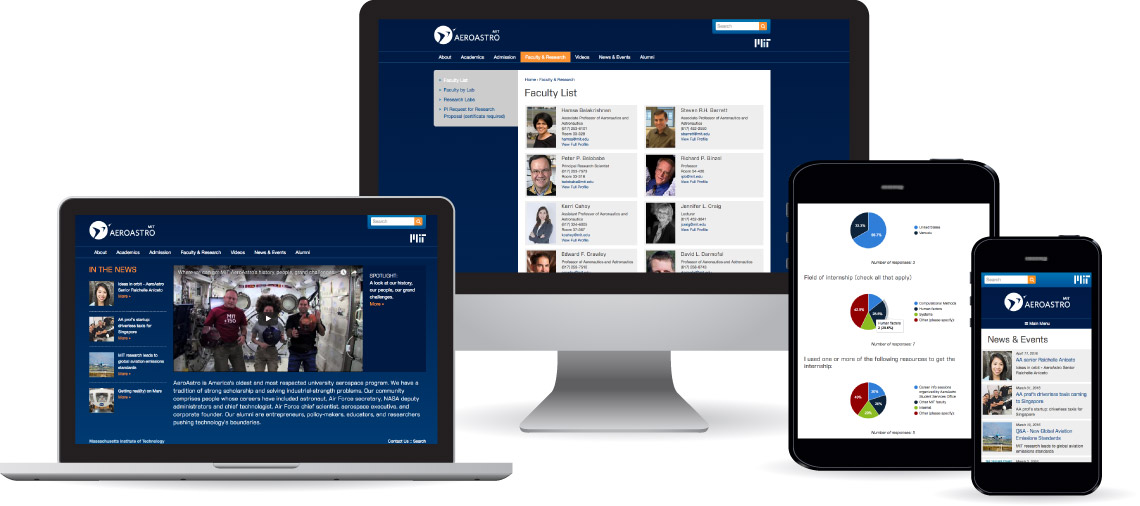
This system has worked successfully on a number of projects. Sites that are using a variation on the Technivant Drupal 7 base theme include: DNA Polymerase Technology, MIT AeroAstro, and MIT Office of Sponsored Programs.
With Drupal 8, we're still using SASS, Singularity, and Font Awesome. However, Blockify is no longer necessary with the changes to the core block system, and since Drupal 8 uses HTML5 and provides extremely minimal twig templates as an option, we've found that the Aurora base theme and modules like clean markup are less important.
With the new flexibility of blocks, we haven't yet needed to use Panels with its new friend, Layout Plugin. The new core ability to add view modes (without code) is something we're also taking advantage of - moving away from field-based views and instead creating reusable view modes with associated Twig templates.